Gabe’s Seasonal Retail Campaign
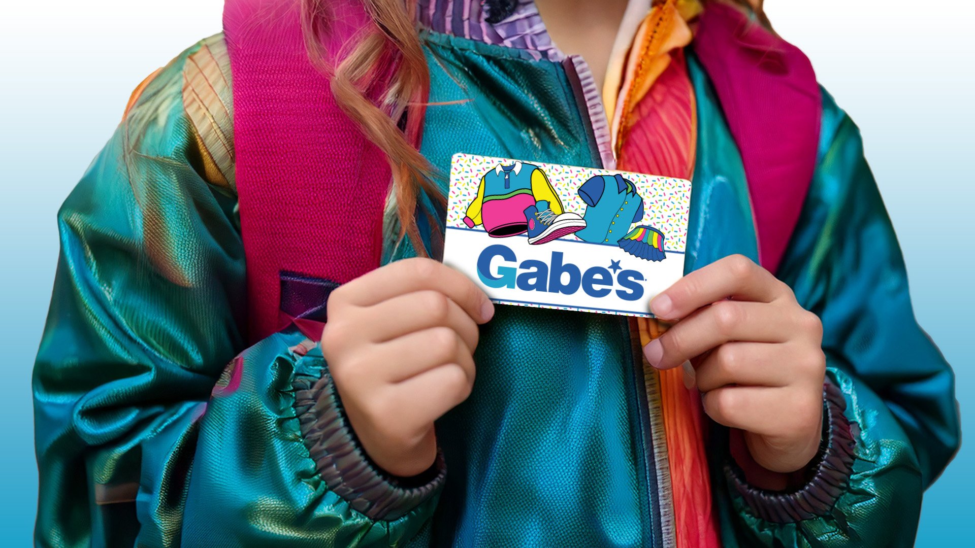
Gabe’s needs to make a memorable Back-To-School campaign, which can be accomplished through creating eye-catching in-store and external designs. To achieve this level of visual pop, there is a heavy focus on illustrated elements to be interchangeably used in signage, tags, gift cards, and social media posts.
Through combining a simple, bright color palette, unique patterns, and a cohesive illustration style, asset designs are memorable and stand out from the crowd. Playful offset typography continues the fun aesthetic, and the bold outlines further push the pop of the design choices, and halftone textures also create a sense of nostalgia and comic-style novelty.


